


17 June 2025
Color is more than just decoration—it’s communication. Whether you’re designing a logo, website, or marketing poster, your choice of colors can influence perception, emotion, and action. For design students, learning how to use color palettes in design is a fundamental skill that separates amateurs from industry-ready professionals.
At Branzone Design School, we teach not just theory but the practical application of color based on branding, user psychology, and visual standards. In this blog, we’ll break down what every aspiring designer should know about industry color standards and how to choose color palettes that work.
1. Why Color Matters in Design
Before diving into combinations, it’s important to understand why color matters in the first place.
Emotional Impact: Colors evoke emotion. Red signals urgency or passion, blue communicates trust, green signifies growth.
Brand Perception: The right palette builds recognition (think Coca-Cola red or Facebook blue).
Functionality: Colors help with usability, contrast, and readability.
Audience Targeting: Different demographics respond to different tones and hues.
So, understanding color isn’t about guesswork—it’s a strategic choice.
2. The Basics: Color Theory for Designers
Every student should understand the color wheel, which includes:
Primary colors: Red, Blue, Yellow
Secondary colors: Orange, Green, Purple
Tertiary colors: Mixes of primary and secondary (e.g., blue-green)
And key color relationships:
Complementary: Opposites on the wheel (great for contrast)
Analogous: Colors next to each other (good for harmony)
Triadic: Evenly spaced around the wheel (for vibrant designs)
Once you know these principles, you can start building palettes like a pro.
3. Industry Color Standards Across Sectors
Different industries tend to follow specific color trends that align with their brand positioning:
Corporate / Finance: Blue, grey, white (trust, professionalism)
Health / Wellness: Green, soft blue, white (cleanliness, care)
Fashion / Beauty: Black, blush, gold, beige (luxury, elegance)
Food & Beverage: Red, orange, brown, yellow (appetite, warmth)
Tech & Startups: Bright blues, purples, gradients (innovation, modernity)
As a design student, you should observe how big brands in different sectors use color—and why they use it.
4. Tools to Build and Test Color Palettes
You don’t need to memorize every color code. Here are some tools the industry relies on:
Adobe Color: For creating and exploring palette themes
Coolors.co: Instant palette generator
Pantone Color Guide: Industry standard for print and fashion
Material UI Color Tool: For web and app interface colors
Color Contrast Checker: To ensure accessibility and readability
Using these tools helps you work faster and more accurately in real projects.
5. Understand Color Psychology
Understand the basics of color theory and its impact on design. Learn about color schemes, such as complementary, analogous, and monochromatic, and how to use them to create visually pleasing combinations. Consider the psychological effects of different colors and their meaning in various contexts.
Each color communicates a feeling:
| Color | Meaning |
|---|---|
| Red | Energy, passion, danger |
| Blue | Trust, calm, stability |
| Yellow | Optimism, energy, warmth |
| Green | Growth, health, balance |
| Purple | Royalty, creativity, luxury |
| Black | Sophistication, power |
| White | Purity, simplicity |
Brands choose colors not just for looks—but for the emotions they want to trigger in the audience.
6. Brand Color Consistency Matters
Once a brand chooses a color palette, it must stay consistent across:
Logos
Websites
Social media
Packaging
Advertisements
As a student working on branding, you should define:
Primary colors: 1–2 dominant shades
Secondary colors: Supporting tones
Neutral colors: Backgrounds, text, and balance
Accent colors: For call-to-action or highlights
This becomes the brand style guide, something every professional designer delivers.
7. Common Mistakes Students Make with Color
Avoid these beginner errors:
Using too many colors (keep it to 3–5)
Poor contrast (especially with text)
Ignoring accessibility (colorblind-safe combinations matter)
Choosing trendy colors without strategy
Inconsistent color usage across platforms
Remember: good color choice supports clarity, not chaos.
8. Practice with Real-Life Projects
At Branzone Design School, our students apply color theory in:
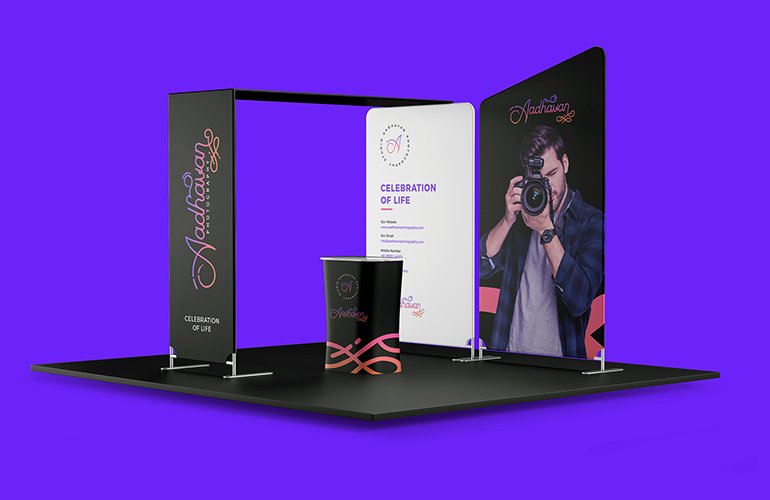
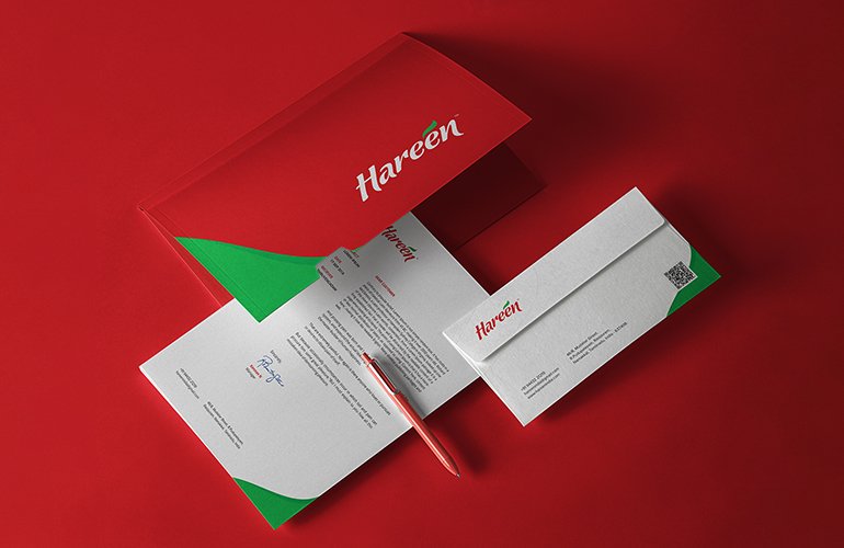
Logo design exercises
UI/UX mockups
Social media post creation
Branding case studies
We encourage students to experiment—but always with logic and brand alignment.
9. Tips to Improve Your Color Game
Save your favorite palettes on tools like Coolors
Create mood boards before starting design
Follow global color trend reports (Pantone, Adobe)
Study the color decisions behind top brands
Use contrast checkers before finalizing web/app designs
The more you experiment and analyze, the sharper your color instincts will become.
Understanding and applying industry color standards is one of the most valuable skills you can develop as a designer. It’s not just about choosing pretty shades—it’s about delivering clarity, emotion, and brand impact through color.
If you’re serious about turning your passion for design into a profession, mastering color palettes is non-negotiable.